One shared UI package for every app, built by agents overnight
I'm mid-sprint, a few hours from finishing, and I stop to change the plan.
The task was to give the app a real component foundation: a proper button, inputs, dialogs, a data grid, the design tokens that hold the colors and spacing together. The obvious place to put all of that was inside the app I'm building right now, the dashboard. That was the plan I wrote down. I was most of the way through it.
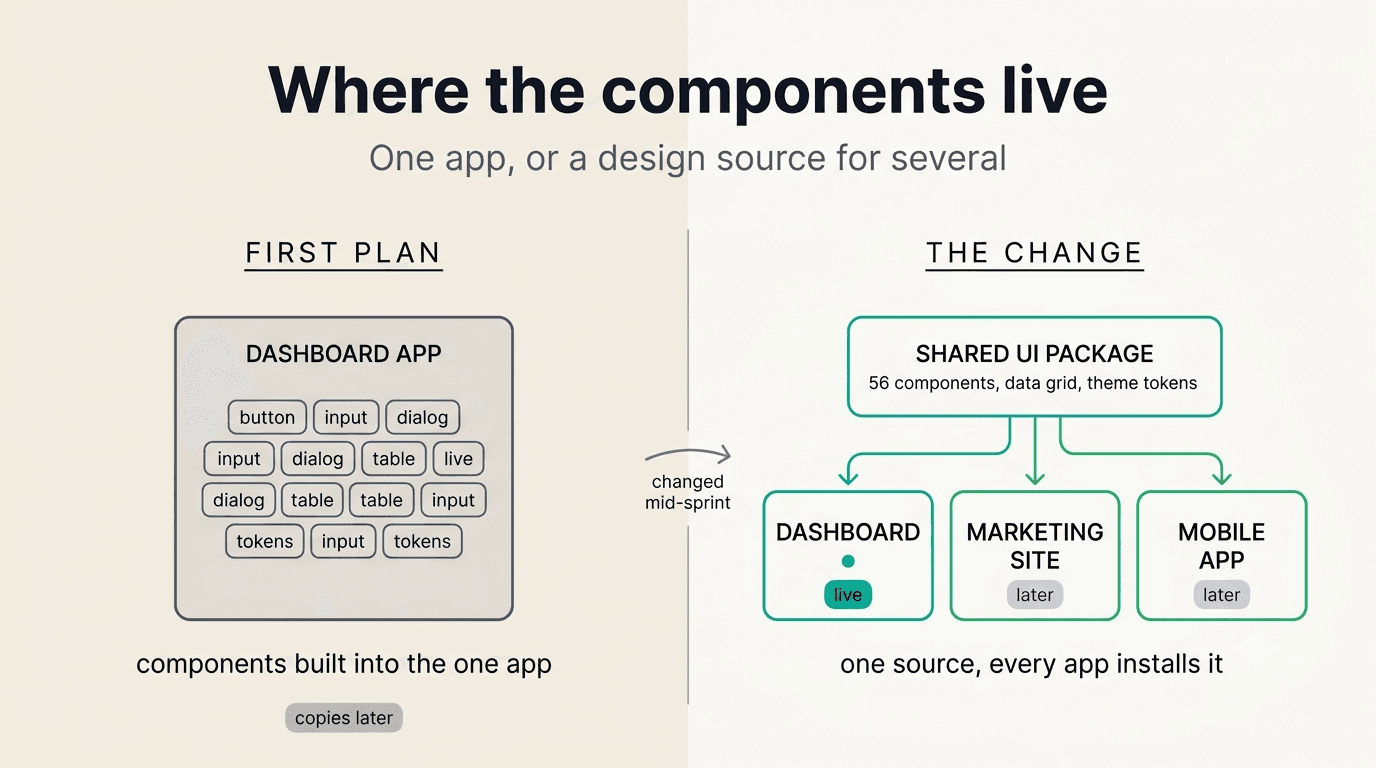
Then I looked at where this product is going. It is not one app. The dashboard is the first surface. There is a marketing site coming later, and a mobile companion after that. If I put the components inside the dashboard, the next two apps would each either copy them or re-import from an app that was never meant to be a library. I have done the copy-paste-the-design-system thing before. It rots. The second app drifts from the first, and by the third nobody knows which button is the real one.
So I changed the plan. Instead of building the components into the dashboard, I pulled all of it into one shared package that every app installs. One place for the components, one place for the tokens, one place to fix a bug or change a color. Then I sequenced the rest of the work into small issues, handed each one to its own agent overnight, and reviewed it in the morning.
The plan I was about to follow
Putting the UI inside the dashboard wasn't a dumb plan. For a single app it is the right plan. You don't stand up a shared library for one consumer; that's overhead with no payoff. The components live next to the screens that use them, and you move fast.
The plan stops being right the moment you know there will be a second app. And I knew. The product needs an authenticated dashboard for the day-to-day work, a public marketing site that has to load fast and rank, and eventually a mobile app for the things that happen on a phone. Three surfaces, all of which should look like the same product, share the same buttons, the same color system, the same idea of what a "card" is.
That is the whole case for a shared package, and it only holds when N is greater than one. It happened to land on me mid-sprint, with the single-app version half-built. The honest move was to stop and redo it, not to finish the plan I already knew was wrong.
What went into the package
The package lives in one folder in the monorepo and every app pulls it in as a workspace dependency. Today the dashboard consumes it. The marketing site and the mobile app will consume the same one when they exist. The backend doesn't, which is exactly right; it has no UI.
Three things live inside it.
Every component, vendored once. All 56 components from the shadcn/ui library, installed in one shot into the package instead of per app. These aren't a dependency you import from npm and can't touch; the code lives in the repo, you own it, and it re-syncs cleanly when the upstream library updates. Putting them in the shared package means the dashboard, the marketing site, and the mobile app all reach for the exact same button.
A real data grid. Carla's work is tables. Payments to confirm, patients to scan, monthly totals to read. So the package ships one reusable data grid built on TanStack Table, and every tabular surface in every app is built from that one grid instead of a bespoke table per screen.
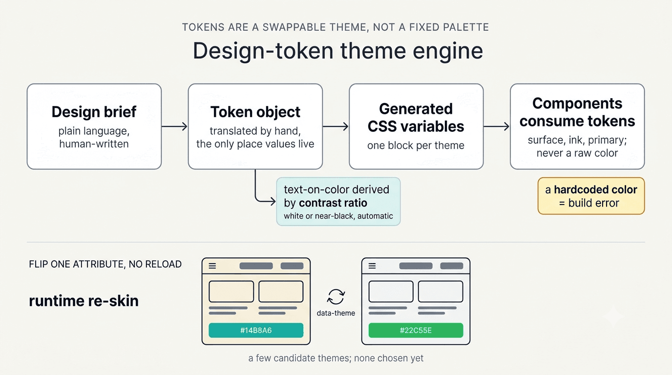
A theme engine, not a palette. This is the part I'm most glad I did properly. The colors, spacing, type scale, and radii are not hardcoded anywhere. They live as a set of design tokens, and the tokens are a swappable theme. A theme starts as a plain-language design brief, gets translated by hand into a structured token object, and a small generator turns that into CSS variables. The components never name a color; they consume semantic tokens like "surface" and "ink" and "primary." Flip one attribute on the page and the whole app re-skins live, no reload.
Two details made it worth the trouble. First, the text-on-color values are derived automatically: give the engine a brand color and it computes whether the label on top should be white or near-black, by contrast ratio, so nothing is hand-tuned and nothing fails to be readable. Second, a lint rule forbids raw color values everywhere outside the token files, so a hardcoded hex is a build error, not a code-review nit. Every app that installs the package inherits that guardrail for free.
There are a few candidate themes in there right now. None of them is "the" brand yet. That's deliberate: the person who will use this every day gets to look at the options on a real screen and tell me which one feels right, and when she does, picking it is one line. The engine exists so that decision stays hers and stays cheap.
How it got built overnight
Here is the part that still feels new to me.
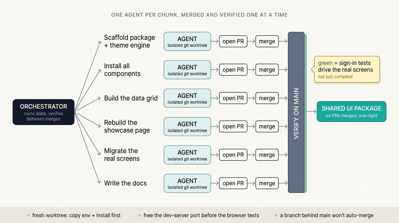
Once the shape was decided, the actual work was mechanical: scaffold the package and the token engine, install all the components, build the data grid, rebuild a showcase page that renders everything, migrate the dashboard's real screens onto the package, and write the docs. Six chunks. None of them needed me to make a decision. They needed someone to do the typing, carefully, and check the result.
So I didn't do the typing. I wrote each chunk as a small, self-contained issue, and I handed each issue to its own agent. Every agent worked in its own isolated git worktree, a separate checkout of the repo, so they never stepped on each other's files. Each one made its changes, ran the build and the tests, opened a pull request, and merged it when the checks went green. I set it up, checked the first one landed clean, and went to sleep.
The thing that makes this trustworthy instead of reckless is the verification. I didn't fire the agents off and hope. One orchestrator held all the state: it owned the task tracker, it owned the pull requests, and after every single merge it pulled the latest main branch and re-checked that the merged result was actually green before letting the next chunk go. "Green," critically, included the authenticated end-to-end suite, the one that signs in and drives the real screens in a browser. So green didn't mean "it compiled." It meant the actual screens rendered and behaved after the change landed.
It is not unattended. I planned it before I slept and I reviewed the look of it in the morning, the same way you'd review any pull request. The agents did the labor between those two points.
A few unglamorous things make or break a run like this, and I only know them because they bit me:
A fresh worktree doesn't have the things git ignores. No installed dependencies, no local environment file. An agent that skips copying those in fails on its first command, or worse, silently skips the sign-in tests because the test credentials aren't there. Copy them in and install first, every time.
Free the dev-server port before the browser tests run. The test runner will happily reuse a server that's already on that port, which means it tests whatever stale code that server is running instead of the new code. A test suite that passes against the wrong build is worse than one that fails.
A branch that falls behind main while it waited its turn won't auto-merge on its own. It just sits there, green and stuck, until you bring it up to date. If you're asleep, "stuck" is the whole night.
This was the first time I ran a build this way on the project. It worked well enough that I later took the same idea further, sequencing a whole feature milestone as dependency-ordered waves of agents, where the hard part was the dependency graph deciding what could actually run in parallel. That's its own story. This one was simpler: six independent chunks, one orchestrator, one night.
What was actually mine
In the morning I had a shared component package, a working theme engine, the dashboard's screens migrated onto it, a showcase page proving every piece rendered, and the docs. Six pull requests, all merged green, all in one night.
I didn't hand-write 56 components. I'm not sure I could have done it that cleanly by hand, and it certainly wouldn't have been in one night. The agents wrote the code.
What was mine was the part before any of them ran. Noticing, mid-sprint, that this was going to be several apps and not one. Deciding to pay for a shared package now instead of three divergent copies later. Choosing a theme engine instead of a fixed palette so the design decision could stay open and stay the user's. Cutting the work into chunks small enough that an agent could finish one without needing me. And building the verification loop so I could trust a build I wasn't watching.
The code was the cheap part. It got cheaper while I slept. The expensive part was deciding what shape to pour it into, and setting up a run I'd believe in the morning.
#BuildInPublic #ClaudeCode #AIAgenticEngineer #shadcn #DesignSystems